In the projects I have seen over thirty years, dashboards increasingly took over. They look polished, automated, up to date. Then someone asks where a single number on the screen actually comes from, and the search begins. The data behind it turns out to sit in different systems, formatted differently, some of it months old, some of it contradicting the rest.
The dashboard was built before the foundation underneath it. I call this the tool-first problem: teams start with the presentation layer because it is the visible part, the one a client or a board will look at, and they build backward from there. In thirty years of working with data I have rarely seen a system that properly documents its own foundation.
A working data system needs three layers, in a fixed order.
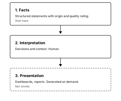
Facts
The first layer holds structured statements, each one carrying a source and a quality rating and linked to the others it relates to. This is where a system records what is known and how confident that knowledge is. Building it properly is slow work. Skip it and everything above stands on assumption rather than evidence.
I am building one such layer myself. In a project of my own I extracted 258 findings from 97 studies, each with a source reference and a quality rating based on GRADE (Guyatt et al., 2008, BMJ), which rates the certainty of clinical evidence on a scale from “very low” to “high”. With that rating you can trace why the evidence behind a recommendation was marked “moderate” and which studies fed into the judgment. Without it there is no Cochrane Review. My own layer is a first version under construction. The connections between findings are still missing, so what I have are index cards rather than a graph. The foundation is there, though, and every view I build from it later will be built on verified facts.
Interpretation
The second layer cannot be automated. It holds the decisions and the context a machine has no way to supply: why market A rather than market B, what a new regulation means for a specific business, where the gaps in the data actually are. This layer needs judgment built from experience. AI can help assemble the first layer, but the second still needs a person who understands the market.
Presentation
The third layer is the dashboard, the chart, the visualisation. None of it is technically new. It works only once the first two layers are in place. Without clean facts and documented decisions underneath, even the best-designed dashboard shows numbers nobody can trace back to a source.
Why the order matters
Palantir has built systems this way for more than a decade. In Foundry the ontology is the foundation, and the value sits in that structure rather than in the frontend on top of it. The large consulting firms have since built their own versions of the same idea.
I have seen clients who still work with the older model instead: order a presentation, receive a recommendation, and the next day the slide is outdated. When the market changes, you have to book the consultants again. That is a service model built on selling the third layer over and over, because the first layer was never built.
A presentation built first is based on numbers nobody can check afterwards. Build the facts first and every view a project later needs can be generated from them.
In my experience no stakeholder cares about a knowledge graph. What counts is the dashboard. The facts underneath still decide whether the dashboard can be trusted.